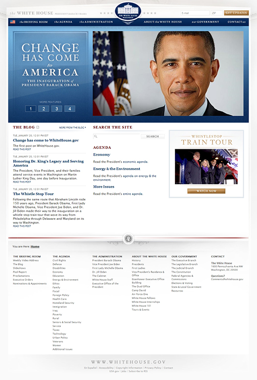
Whether you noticed or not, WhiteHouse.gov casually turned 20 this past Tuesday. That’s right – it was two decades ago this week that the very first version of WhiteHouse.gov was introduced to the world by the first term of the Clinton administration.
We understand that it may have been awhile since you reflected on how far our nation’s information infrastructure has come and how much the website of the president has changed, so we wanted to zoom out for a second, recap some of the highlights of how WhiteHouse.gov has progressed, and forecast some future improvements that are currently under way.
The original website was created to present the White House as the home of the president, the workplace of the head of state and head of government for the United States, and a living American cultural and historical institution. It was ahead of the curve simply by existing on the “world wide web.” (Which was how we referred to the internet back then.)
In 1994, 2 percent of American households had access to the internet. Source: NSF.gov
On its first birthday, WhiteHouse.gov reported that the average number of daily users had more than tripled in the first year and that almost 150,000 people had signed into the “electronic guestbook.” Plans for the next iteration of the website were already underway.
Throughout the lifecycle of the first website, new features were developed, including that guestbook we mentioned — which wasn’t available on day one, a Presidential welcome message, a vice presidential welcome message, information about the Executive branch, a series of webforms for public or organizational comments, and press releases. Many of these things have lived on in various forms throughout the past 20 years.
The Obama administration has carried on the tradition of highlighting the White House as a home, workplace, and historical landmark — and we’ve added a new commitment to transparency, public participation, and collaboration in government that was integrated into the initial website structure and design in 2009. The original website of this administration was built on Drupal 6, an open-source content management system (CMS), so that the website would be more secure and more flexible to change and adapt over time.
The transparency and participation were also carried over in the site design. The design kept users and their needs front-of-mind with intuitive navigation that limited initial choices, but provided an immediate sense of President Obama’s priorities in the drop down menus; email integration that was groundbreaking at the time; a simple and tight style guide of colors and fonts that kept the experience of WhiteHouse.gov unique and professional.
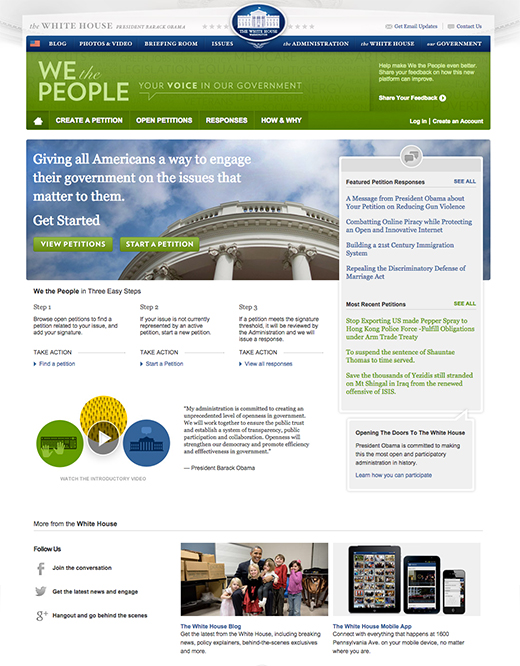
In 2011, we launched a new online petitions section, We the People, to give Americans a way to petition their government around the issues they care about — and provide a pathway to receive a formal response. Continuing the trend of making iterative changes to improve government services for the public, the We the People platform has seen a number of upgrades over the past three years, including the addition of a simple signing system in June 2014. As of September 2014, more than 15 million users have participated, collecting more than 22 million signatures on more than 360,000 petitions, and having received nearly 250 White House responses — one of which happened to be the most popular piece of WhiteHouse.gov content of all time. If you haven’t seen it yet, you should check it out.
Here at the WhiteHouse.gov, we're proponents of using "open source" code — which just means it’s code that anyone else can use, too. But we're not just using open-source code — we're creating it, too. We want to give citizens, coders, and state and local governments a way to use the tools we've built. Just this week, we released something called a “write API” (short for “Application Programming Interface”) for We the People, which allows outside organizations to submit signatures to We the People without having to come to our website. It’s the first and highest profile public write API service hosted by the government.
Today, technology and innovation are fundamental to our ability to hear from and communicate with the public.
In 2012, 78.9 percent of American households had a computer at home and 94.8 percent of households with a computer used it to connect to the internet. Source: Census.gov
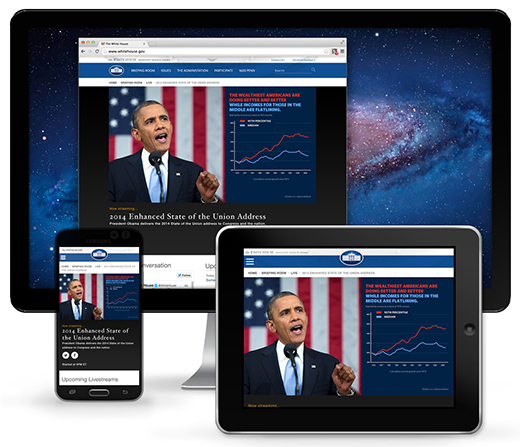
We’ve been gradually adapting the current iteration of WhiteHouse.gov to meet the evolving needs of the most technology-savvy American public in history – folks who are consuming information in different ways and looking for meaningful opportunities to engage on the topics that matter to them. A big part of this is bringing WhiteHouse.gov directly to the American people, where they are.
About 40 percent of people in lower-income and minority groups say they primarily use their cell phone to go online. Source: Harvard Business Review, PEW
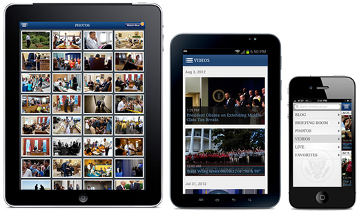
Starting in 2010 with the launch of the initial White House iPhone and iPod touch application, we’ve consistently delivered content like livestreams, blog posts, and behind-the-scenes photos and videos into the hands of mobile users. We later released an Android White House application and a number of updates to make all White House apps compatible with the newest devices. The newest update will be available later this year, integrating touch, animations, and a more modern design. Hundreds of thousands of Americans have used our mobile applications to access WhiteHouse.gov content.
In April 2012, we also released a mobile theme — allowing users to more easily see key pieces of our desktop content on their mobile devices.
However, serving reduced content for mobile devices is no longer acceptable.
It’s estimated that mobile users will surpass desktop users by the end of this year. Source: Morgan Stanley
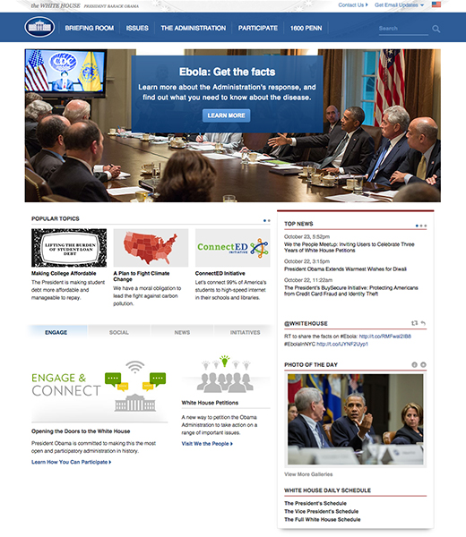
We’ve started rebuilding WhiteHouse.gov to be responsive, allowing the same content and design to display seamlessly for users, regardless of their device. Check out our progress so far in the Sharables section, displaying the most shareable content from across WhiteHouse.gov; the 2013 State of the Union page, where hundreds of thousands of users tuned in to watch and participate in the President’s address last year; and our brand-new Live section, where you can tune in to White House events in real time with curated content around the stream to help supplement and inform your viewing experience. A key part of this transition has moving the website to the newest version of Drupal, Drupal 7, where we can continue take advantage of our content management system's ability to keep the website secure and adaptive, but utilizing the latest tools and resources, and having the support and engagement of the open-source community.
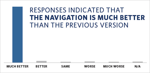
While we’re at it, earlier this month, we updated the navigation to better accommodate the needs of our users by making it better demonstrate the changing content on WhiteHouse.gov — for example, adding a "Participate" tab that provides various ways to engage with the White House and administration — and greatly improving the site’s accessibility. We asked our users for feedback on this change and overwhelmingly they reported that the navigation was “much better” than the previous version:
But we have more work to do.
“Outstanding. I look forward to your implementation throughout the entire website.” – Recent feedback from a WhiteHouse.gov user
We’re also updating our style guide to provide an even more consistent brand experience — including the use of webfonts, which we’re happy to report are coming soon; updating our forms to be more integrated into the website; and making the rest of our website fully responsive.
Your feedback is essential to us making improvements that will positively impact your experience on WhiteHouse.gov. So you tell us: What should we work on next?
Related Resources:
- Learn more about our development tools and resources on the White House developers page.
- Share your thoughts on the new Live section on our feedback webform.
- Want real-time updates on WhiteHouse.gov developments? Follow us on Twitter at @WHweb.
- Download the mobile application: iTunes, Google Play
